


Friday, November 17th, 2006
What, This Old Thing?
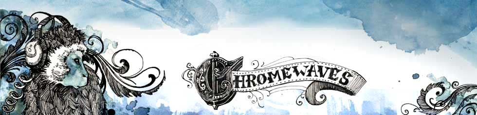
So hi and welcome to Chromewaves.net v7.0. Now 50% cleaner and lighter with no unpleasant aftertaste. I’ve needed a facelift for some time and now, here it is. You like? Thanks to Ms Renée Nault for the beautiful masthead – far nicer than the horribly dated rendered turntable I’ve been rocking for the past couple years.
While I’ve tried to ensure that the transition is as seamless as possible, I don’t doubt that there are some pages that are going to look weird or, at worst, not work at all – if you find one of these please let me know. But I’ll be making cosmetic tweaks through the weekend, getting this ride all pimped out, as the kids say.
Otherwise… yeah. Redesign. Woot.
Now I have to go watch The Office. Go Team Pam!
Category: Uncategorized


11/17/06 1:42 am
brand new hotness
11/17/06 1:46 am
Pam is just ruining things for herself and it’s making the show so good.
11/17/06 3:12 am
Looks even better than the old version!
11/17/06 4:31 am
Wooo, faaaancy! Looks nice!
As for The Office – my mild social anxiety disorder gets COMPLETELY set off by that show (and the UK version as well) – to the point where I’m constantly feeling like I have to change the channel or get up or fast forward. It’s very uncomfortable for me to watch it.
11/17/06 8:20 am
I like the new version Frank. Looks good.
11/17/06 8:28 am
Woo hoo! Awesome.
11/17/06 8:29 am
Looks great! Very nice.
11/17/06 9:13 am
NICE!
11/17/06 9:17 am
Wow. This looks great.
11/17/06 9:39 am
Wow…so much brighter. But very nice!
(Also, thanks for the Jetplanes review yesterday! It left me walking around with a dumb grin on my face for the rest of the day.)
11/17/06 10:10 am
actual reaction: whoooooooa!
very nice!
11/17/06 10:31 am
Oooh, fancy! And bright. Really, really bright. I’ll have to remember to never check chromewaves when hungover. ;)
11/17/06 10:33 am
Fancy!
11/17/06 10:52 am
congrats on the animal intelligence redesign. make sure you’re paying it minimum wage or PETA will be commenting.
11/17/06 11:01 am
i like, Frank.
the masthead is spectacular indeed.
i love the lightness of the layout, even if it does remind me a bit of …Pitchfork? sorry;)
11/17/06 11:49 am
Looks great.
11/17/06 12:04 pm
Frank – the new design looks great and i LOVE the new artwork.
11/17/06 1:53 pm
Niiiize.
11/17/06 3:57 pm
Nice – someone who actually has time to redesign their web site! Great work.
One suggestion: make the header clickable back to the home page as there doesn’t seem to be a way to get back there in the individual story pages.
Sweet, though.
11/17/06 5:31 pm
That masthead is amazing!
11/17/06 6:21 pm
The first time I’ve ever immediately loved a re-design. Like they said. Awesome.
11/17/06 6:55 pm
That masthead art is gorgeous, kudos to the designer.
But why is the entire site aligned left for me (not centered on my screen)? Maybe that’s just a Firefox issue?
11/17/06 6:57 pm
Beth – the site is meant to be aligned left, it’s never been centre-justified.
Or is that not what you meant?
11/17/06 7:21 pm
erm.. what thierry said. in fact, chromewaves is now so bright that i can’t pick out the lightblue links on the fly anymore – i’m forced to actually read the f*ing articles.
now, while you’ll presumably think that’s a good thing, this (along with the ever decreasing amount of mov video links, ominously encroached by the plague of sh*tty u2b links) will mean i’m going to be checking in a lot less often. and to think chromewaves was practically the only music blog i was still checking in to.
oh well. only blogotheque left, then. ho-hum. toodle-oo.